Sunday, November 28, 2010

Susan Sontag Q and A

1. I took this image of a friend of mine as I was teaching her how to breath fire for the first time. The image is a documentation of an invent and an achievement of an individual. The goal here is to preserve a memory.

2. The obvious answer here is that the relationship is one of friendship, but the emotions at the moment the image was shot lean more on the side of pride. A desire to show off what a friend can do and what I had taught her. The lack of flash leaves the subject to be eliminated by the warm glow of the fire casting her in an almost heroic light.

3. The image is a snap shot, a moment in time and as such is meant to be seen in the same light. It can be viewed by anyone and they would see the meaning behind it or by those who were there and who would attach a memory to the picture. Either way it is intended to be viewed fairly quickly.

1. This image was taken of a friend/coworker of mine and myself by an ex-girlfriend of mine, who was also an art major, on our last day in Columbus Ohio while I was touring. Our employes had taken us out to a local bar to say goodby. Here to there is an element of documentation but one holding a deeper personal meaning than the first image. The goal in this shot is to somehow hold on to a moment and a person the photographer is losing.

2. This image was shot during a time of happiness which concealed sadness. The image reflex these conflicting emotions. The colors are bright and vibrant which normally suggests happiness but they are also glaring and harsh. The woman in the background looks on with a sense of familiarity but also distance like she has been through the routine of making friends only to hold them at arms length knowing she will soon be leaving them. The man in the foreground is the main subject taking up a third of the image, yet the image was taken at a time when his back is turned from her and face is concealed, showing distance and separation.

3. This image hold emotion and as such one must take more time to examine what those emotions are. Its interned viewer are the subject and the photographer.  

1. This is not your stereotypical war documentary photo. While most war documentary shots focus on the horrors of war here we see a human side which is normally overlooked. By focusing so closely on a soldiers face while he is crying the photographer forces the viewer to sympathize and empathize with the soldier. The objective of this photo is to show soldiers as people too, ones who are every bit as affected by the horrors of war as civilians.

2. Cynicism aside, it would be easy to say that the photographer felt a strong sense of sympathy and sorrow for the soldier. One might also read an urge to protect the soldier, perhaps this is why to image is cropped so tightly on the face in order to shield him from any bad connotation that many have with the sight of weapons or of military uniforms. By doing this he, once again, simply becomes a person.

3. An image as simple as this can easily be glanced over in passing but the intent behind it is that the viewer take the time to let the meaning soak in. for an image such as this to be effective it must be seen by as many people as possible.

Saturday, November 27, 2010

inflatable

A brief overview

The concept: (provided by one mister Mark McMurray) was simple enough. A large inflatable room in which movies would be shown via a portable projection unit. In other words a blow up movie theater.

The plans: a large inner skeleton made up of connected air bladder being filled via one large air pump.

Materials: 2,000 square feet of black plastic, two irons, one projection unit, one large work fan one white tarp and other odds and ends.

We chipped in to buy the plastic and drop cloth, mark provided the irons and projector along with the sound system, and I provided the air pump, work fan and laptop. (because Mark crashed his the night before haha) Alina did the lions share of the math, thank God. And we all took turns welding the plastic together using the irons on a piece of aluminum foil over the plastic. (thanks Bill and Kathy for showing us that trick that might have taken some time to figure out) We started it all off by welding the tubes together that would make up the inner skeleton of the structure testing each ones strength as we went. Once completed we, in this case Mark and Juston, glued and ducktaped the tubes together. They found out the the glue was easier to apply and with the tape just as strong as the welds. Next we skinned the structure. This consisted of measuring and cutting sheets of plastic and gluing them onto the inflated skeleton, a lot easier said than done this took all Sunday and most of the night. The whole thing worked great once we patched large holes the structure was ridged and self supporting. That is until we took it outside. Once in the wind, as we feared, the thin plastic was no match for even a slight gusts of wind and would fold to the ground. We figured out the solution to this issue would be could solve to problems. If we were to cut a hole into the side of the building and attach a large powerful fan via a plastic shroud to the structure this would give inner support to the building while circulating air in the otherwise hot and stagnant structure.

The Big Day: windy, cold in the shade and hot in the sun, at least for a large black building. We picked out a spot on the grass where sitting would not be an issue and erected our building. It went up fine and seemed to be working until the wind blew. Even with a combination of supporting air systems the plastic still lacked the structural integrity needed to be free standing in wind. So like good little boy scouts we tied thin, light rope to the four corners and stacked the structure down. Next we staked the building itself down using tent spikes. This gave resistance to the structure during wind and virtually eliminated collapsing.

All in all the ideas used to construct the building and the techniques applied were successful, (this is the part I cared most about) and the crowd had a mixer of responses ranging from mild interest to simple indirection. But no one thought it was stupid or hated it, still most people were put off by the stupid street preaching anti-Christ so what can you say?

Contemporary photo based art


straight: the oldest of old school. Straight photography is what it sounds like just plain photo shots of objects and people. Sounds simple. Its not. When you take away all the toys and trick, you remove all the cliches satire and you are left with composition, light, darkness, movement, line, form and beauty. This in my opinion is where photography truly becomes art or, more often then not, trash. With the right camera at the right place with the right eye and artist can take an image that will become synonymous with that place or time etc. but, if even one of those elements is not perfect and you are left with mundane rubbish.

Steeling: something that has been at the core of photography since its inception. Even at the beginning photographers stole ideas and inspiration from the paintings of grate masters this may very well be to blame for the hesitance of traditional artists to except photography as an art. In later years photographers now look to steel ideas, images, personalities and icons in an attempt to create new worlds or simply make a name for themselves out of shocking the art word.

constrictive world: when thinking bout this idea with a modern knowledge of art and the tools available ones mind instantly goes to photoshop and the infinite possibilities it offers. However, this is just as old as any concept in photography, artist have been arranging models in elaborate sets for well over a hundred years in order to create and recreate works of art like those of the old masters.

stranger than fiction: sometimes the world is enough. We have all seen things that we didn't think possible, things that could not and can not be explained. I'm sure its not a stretch to say that we have all seen things which people have created that seem impossible, a shark forever entombed in a museum, or people walking from building to building on wires no bigger than your finger. These things seem fictional and if captured by any medium other than photography they would lose all creditability whatsoever. However, despite the illusions we can create through the use of photoshop and other tools people still tend to believe a photo long before they would a painting or other work. Making it the perfect medium to capture such images.

personal narrative: the truth that photography can offer though the use of straight photography make it ideal for personal narratives. If you were to take a camera with you everywhere you go for one year and take a photo of those places you see the people you meet and yourself doing the things you do everyday, anyone could have a wonderful clear idea or who you are as a person. Assuming you were honest with what you took pictures of. For this purpose the photo is better than almost all and at least par with videography .   

Mark making Mini poster crit

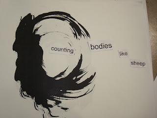
I am afraid I have misplaced or deleted the images that go along with mini poster crit but I still have the notes so here's what I have (not direct quotes). Bad news first, as always

Bad (regarding an overview of all the mini posters): There seems to be a narrow range in type of mark, mainly seeming to do with drips or splatters etc. The words in some of the works seem “Bla” and don't become marks themselves.

Bad (regarding the final poster): {I don't know if this is a bad thing} this piece is much better turned to portrait rather than landscape like you had it.

Good (regarding an overview of all mini posters): The marks hold a lot of emotion, they are strong and masculine, closure is very strong ie it is easy to imagine these as violent or scary especially with the phrase. The words have good spacing, the meaning is clear and makes the marks look like monsters or blood.

Good (regarding the final poster): the words in the final work are easy to read and the one sideways word captures interest, the mark seems like blood and the phrase helps that.

My crit.

Bad: Some of the works seemed like cartoon villeins even though they were ink blots so maybe that's just me. I had a hard time not getting the feeling that the pieces seemed cliche.

Good: The final piece needed the most interpretation and I believe that help to make is less cliches. The placement of the words were similar to that of Da-Da art something I always like. Da-Da also worked in nonsense and chaos much like the way the marks were made in the first place so I felt this fitting.  


I found the pictures:


Tuesday, November 16, 2010

bugs

motion


balance


rhythm/relation


space


texture


color


shape


line


whole object


abstraction


scale


positive space


negative space


closure


light/dark


Sunday, November 7, 2010

MFAH Museum questions

1. What was the most enjoyable thing you saw?

  • I really enjoyed the Spanish Contemporary exhibit, this was the first time I had seen it.


2. What was the most disturbing thing you saw?

  • I don't think I would classify anything there as Disturbing.


3. What piece in the museum is most like something you would make yourself?

  • I don't know an exact piece but if I had the abilities I would sculpt marble in the Greek classical style. However, as I stand with my abilities now I would and do similar work as those found in the Spanish Contemporary works.


4. What made you curious, what did you want to know more about?

  • Once again it would have to be the contemporary exhibit simply because I am well acquainted with this museum and its permanent collection.


Tuesday, November 2, 2010

Self portrait crit

So got a big reaction I'm always for that. People seemed to like the piece and touching it proved to be to much of a temptation for many people but that was fine me for this work and nothing got out so no harm done. Ok, the crit.

Good: The bees; they brought movement, color and tension to the piece. The bowl: was clean lined and simplistic. The Bible: brought a whole other element to the piece and let if up to interpretation, using a large old Bible made it more affective as a statement.

Bad: um... they seemed to like it

Interpretation: 1. The Bible was protecting everyone from the danger. 2. The Bible was an ideal that no one reach. 3. The Bible was killing us, thus we were the bees. 4. The Bible was heaven the bees were hell.

self crit

I wish I could have had more bees but I was happy the piece worked at all so I’m not complaining.

The first interpretation was right, and proved that my meaning came through however I felt the viewers were led away from my meaning in an attempt to vary the interpretations.   

Thanks to Mark and Juston for helping me catch the bees and Tam for the pics and the rest of T5 yall always rock and you know who you are