I am afraid I have misplaced or deleted the images that go along with mini poster crit but I still have the notes so here's what I have (not direct quotes). Bad news first, as always
Bad (regarding an overview of all the mini posters): There seems to be a narrow range in type of mark, mainly seeming to do with drips or splatters etc. The words in some of the works seem “Bla” and don't become marks themselves.
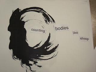
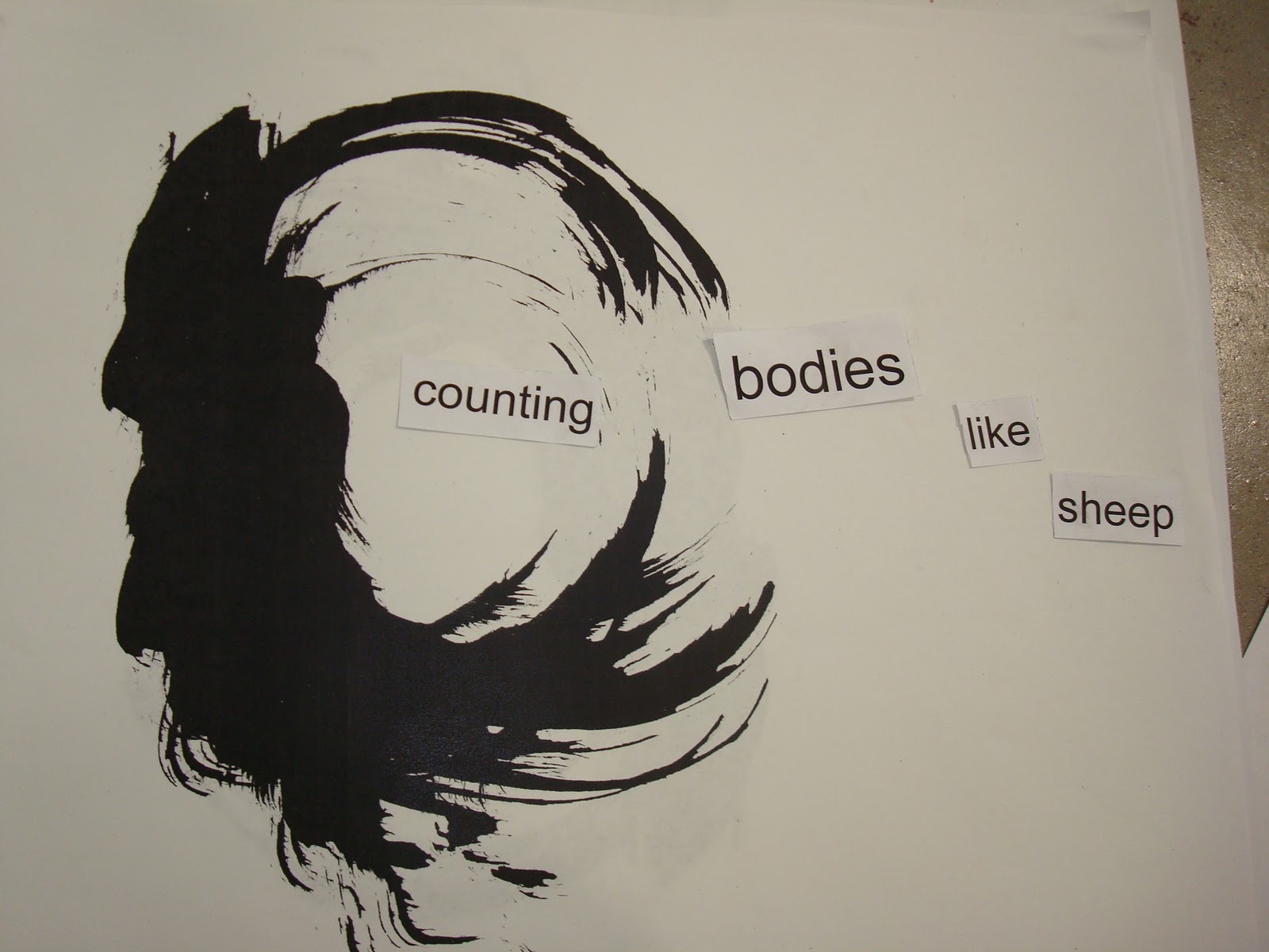
Bad (regarding the final poster): {I don't know if this is a bad thing} this piece is much better turned to portrait rather than landscape like you had it.
Good (regarding an overview of all mini posters): The marks hold a lot of emotion, they are strong and masculine, closure is very strong ie it is easy to imagine these as violent or scary especially with the phrase. The words have good spacing, the meaning is clear and makes the marks look like monsters or blood.
Good (regarding the final poster): the words in the final work are easy to read and the one sideways word captures interest, the mark seems like blood and the phrase helps that.
My crit.
Bad: Some of the works seemed like cartoon villeins even though they were ink blots so maybe that's just me. I had a hard time not getting the feeling that the pieces seemed cliche.
Good: The final piece needed the most interpretation and I believe that help to make is less cliches. The placement of the words were similar to that of Da-Da art something I always like. Da-Da also worked in nonsense and chaos much like the way the marks were made in the first place so I felt this fitting.
I found the pictures:


I found the pictures:


No comments:
Post a Comment