Thursday, September 30, 2010

Menil Answers

I would have put the questions too but I lost the paper. sorry
1.     1.  I don’t know the name of it but the most enjoyable this which I saw at the Menil was the pendulum outside the entrance of the main building.  The clean lines and perfect proportions of the piece embody mastery of a chosen medium.  The knowledge of the works weight is a wonderful contrast to the seemingly effortless way in which it sways in the breeze.
2.     2.  I’m not sure if there was anything that I would have described as disturbing.  I might say the works of Picasso might fit this description best.  However, my knowledge and distaste for the artist and his chosen style may be the true reason behind me saying this.
3.     3.  Once again I would have to say the pendulum.  This piece is very much my taste and style, in fact the moment I saw it I instantly began thinking of what it would take to make something similar and where I could possible hang such a large piece.
4.  4.     This may be outside of the parameters of the question but the thing which most interested me was the museum itself.   I love free museums they afford one the opportunity to slow down and study works, also the idea behind the neighborhood portion of the museum is wonderful.
5.   5.    I think the main building was near perfect.  This is mainly to do the ceiling and how it was designed to allow natural light in to show the works as best as possible.

A sick realization, and unanswered question

This has little to do with school, well; I guess that’s not entirely true.  It has to do with me and how I am living my life at this moment and that is heavily influenced by school so, I guess maybe it does. 
I just started a new job, I hate it.  It’s a menial position in a mail room…. I’m not kidding.  It pays well enough I guess, way more the position is worth, but I can’t stand it.  I’m about to head in to work right now and it will be my fourth day.  It is literally taking everything I have to make myself go.  That’s not like me I have had jobs since I was 15 I believe in working hard and try to do so, so this is new.  I have come to realize it’s this classes fault.  While I have never liked working for other people and in fact started a company so that I would never have to do so again, I now feel a new disgust with the whole afar.  I’m working on being a junior so it’s not like this is my first art class, but it is the first one where I have started to feel like an artist… somewhat.  With that said, I don’t know what to do.  I feel can’t go back, not to something like I am doing now.  I know what I want to do and working for a corporation has nothing to do with it and never will.  I am lost. 
How do you make money as an artist, especially before you have even gotten out of school?

Accordion Book

My accordion book is not how I hoped it would turn out to be.  I first made the book by spray mounting my textures onto mate board and the spray mounted those to a large strip of black cloth.  It didn’t work.  The board pulled right off and the only one that held at all ended up pulling the back off of the board when I removed it, which of course meant I got to make a new texture and remount it.  I chose then to simply use some black cloth tape, but I have not been able to find any and the only black tape I have found is duct tape which is shiny, not at all what I wanted but… so it’s done, for now.  If I can find time in the near future I have every intention of redoing it.  
We will see.


3D Dots

I chose to use this pattern of dots as I believed it had the greatest range of possibilities.  Also, I just like this arrangement.  I personally think that it looks like a skull and so I decided to play off of that.  I lined a box with newspaper and overlaid the newspaper with hand written love notes and sonnets from Shakespeare.  I cut a frame for the piece out of a piece of wood and placed it midway down the box to give another dimension of depth.  For the dots I used two piston head which I found in the dumpster behind the Agricultural building across the parking lot and the ends of two 7mm rifle rounds.  I particularly like the rifle rounds for this piece and if there were any such thing as an obtainable bullet the size of a piston I would have used that.  I used eye hooks and wire screwed into the back of the frame to mount the piece.


The base of the work
Using a calligraphy pen to write out the letters 
The pistons and bullets (kind of looking like a frog at this point)
This was my first attempt using only white paper. 
The final work (not the best camera, thus not that great of a picture)


Sunday, September 26, 2010

Human dots


In


For the Human Dot project we used multiple sizes of dots with a variety of heights for perspective.  For our white background we used the sky on a partially cloudy day, this was the clouds provided a white backdrop while the breaks in clouds provided a contrast of color and texture. 

Sunday, September 19, 2010

The Exquisite Corpse Two

The rambunctious ball dancing, a bounding tangerine.


This sentence is so bizarre that I had a hard time finding something to relate in any way to it.  The other problem I faces is that while odd the concepts presented in my sentence are so familiar that everyone has an instant idea of what it would look like for a ball to dance with a tangerine.  This is why my first literal translation if the idea seems so straightforward and cartoon like.  Here I took a completely different approach.  Nothing was jumping out to me about this so I walked around taking random picture and nothing turned out.  So I started taking pictures around the house and took this image of a clock with a spinning ball pendulum.  I liked the way the balls moved and it reminded me of the sentence.  I chose to shoot the image in black and white to highlight the contrast and details of the clock meconium.  To show the connection between the clock movement and dancing I slowed the cameras F-stop and spun the pendulum, this way when I shot the image I captured the motion blur and tide in.

Saturday, September 18, 2010

Newspaper Tower

I just saw that I had never written about the newspaper project we had on the first day.

This was a pretty straight forward project, the goal here was to make as tall of a structure as possible that would support a cinderblock using only newspaper and masking tape.  I didn’t have any catastrophic learning opportunities here, thankfully.   I chose to use time tested principles and they ended up working well.  I based my design on the cylinder and the triangle which are two of the strongest shapes in engineering.  I counted out each sheet of full sized newspaper and divided them evenly into six stacks; I used an additional stack, plus the extras, to for the core of the structure.  I rolled all seven stacks tight cylindrical shapes and used the masking tape and tightly raped the whole tube. I then took the half sheets of newspaper and folded them into thick straps.  I placed two cylinders at three corners and one larger cylinder in the center.  I attached the tubes together using the newspaper straps and masking tape and there ya have it, one newspaper tower. 

Squares

Not all the much to say here, below are some of the thumbnails of my squares.

These are the finale four, they are kind of hard to see sorry bout that. This was before I had sharpyed them.

And the final two up on the wall at Wash.

Recap of cardboard project and pictures of final product.

Here is the recap of the process I used to make my cardboard sculpture, les the failed attempts.

         Dumpers dived at an auto body shop, auto parts come in large thick boxes to protect from damage.

      I then cut rough circulars of cardboard and laminated them together using wood glue that I rolled on to each layer.  Once glued I stacked the cardboard and placed weights on top of the stack and allowed to dry overnight under compression.  This is the same process I used to make the stem.
1.       Next I took the laminated mass and cut a rough spherical shape using an electric saw and hand sander.  With the stem I took the stack and cut a rough shape out with a band saw.

1.       After I had decided to turn the ball on my homemade wood lathe things went faster.  I used a high strength cloth backed course grit sand paper and shaped the ball on the lathe.

I then took the stem and shaped it using a hand sander.


1.       I used solid core cardboard for the spikes.  I could not find a place that sold this so I cannibalized it from the back of several sketch books I had.  I cut spikes and a rough curve shape as close to fitting as I could with a band saw and with a drimel like tool honed it down closer to the profile.   
  

      Then I glued the whole lot together it was done.

1.       The last thing I did was make a stand.  I took some scrap Lexan (Plexiglas) and using a Pin measurer I found the circumference of the ball.  I transferred this to the Lexan and cut it out with the band saw and made two interlocking notches that held the stand together. 


Critique
The material was handled well and in such a way that it became lost and hand to be studied to see what it was made of.  The abstract style of the work left it up to interpretation by the audience.  The use of geometric shapes mirrored one another and created a feeling of rhythm.  The use of the stand was liked and felt necessary by most, unfortunately it kind of seemed the teachers did not share this opinion.

Wednesday, September 15, 2010

Saturday, September 11, 2010

update on cardboard project and DIY wood lathe pics

The right tool for the right job is not always available so make it.
I use to have a wood lathe which would have made short work of this project if the motor hadn’t burned up and the whole thing scrapped without my knowledge.   So I have tried a number of saws, sanders, grinders and just about anything I could think of to shape this thing.  Nothing has worked well and the ball is completely uneven, which would not be such a big deal except the idea I am working towards is stylized and I think it will add something to the piece to have everything as close to perfection as possible.  This way the piece will be an idealized version of nature.  So, not satisfied with the shape and unable to find a tool that worked I decided that make it myself.  I took 2by4s and drilled holes in them I then drilled a hole through my ball.  I placed a threaded rob through the ball and 2by4s and locked the ball down with washers and nuts and clamped the 2by4s to saw horses.  I chucked my rig into a drill and made my very rudimentary wood lathe.   After a good two hours or so of sanding, bloody nose and three missing knuckles later and I got what i have now.  It’s still not perfect but is a hell of a lot closer and I’m now happy with the shape.  I also finished carving and sanding the stem.  All I have is the spikes left.


Looking pretty good I think

Monday, September 6, 2010

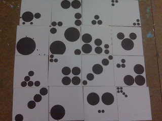
Final 4 dots

Below are the finale 16 images I presented to my table for critique.


From these my tables choose these four images which they thought best represented the Gestalt principals.   


After some thought I decided that I disagreed with two of the sections which they had made and replaced them images from Continuation and Proximity.  My final four are these.  

I feel these better represent the principals of Continuation and Proximity.  I have chosen to leave the images untitled at this point so that when they are Critiqued they must speak for themselves.

Cardboard Progress

This has been quite harder than I first thought it would be.  I am now on my 3rd working idea for this project and the first one which seems is going to work out. 

My latest idea it this, make a layered cylinder of laminated cardboard,


 I will then saw a rough spherical shape into the cardboard using an electric saw.  


Once my ball had been formed I would sand using an electric sander to make a more perfect shape.


 with this done I will drill holes to mimic those found on a real sweetgum ball and carve spicks and a stem out of cardboard which I will attach using wood glue.  So far, I am to the sanded sphere stage.

Wednesday, September 1, 2010

week one reading synopsis

The reading assignment for this week focused on the critique and how the principles of Gestalt theories subconsciously affect our perceptions.
Gestalt theories show how the human mind fills in the gaps left in our day to day lives and how that bleeds over into our perceptions of art.  Closure, continuation, similarity and proximity are the fundamental principals.  Each of these elements or a combination there of, helps us to make sense of the world around us.  In art however these laws of perception can cloud the judgment and understanding of a work.  If an artist has a firm understanding of these fundamentals he can use them to shape the way the viewer perceives his work.  In this way one can use the nature or perception to communicate on a leaving that none visual mediums never can.
The important aspects of the critique are discussed in much detail, things such as the importance of line, shape, form, color and the difference between abstraction and realistic representation.  Line, for example, is spoken of as the most basic of all forms of mark making.  I happen to disagree with this statement simply because the dot or point would, to me, seem more rudimentary than the line.  Regardless, the author delves into the elements of the line and how it has meaning.  Lines are made all the time by more than just mankind, animals make lines every day.  So what is the difference between those marks made by nature and beast and those made by the conscious man?  Meaning.  In short the answer is the meaning behind the mark and how it is conveyed by the artist.  For example, a thin hesitant line with all the stops and starts of an unsure hand tells a different story than a bold flat line made by the confident one.  In this way meanings can be discerned by even the simplest of marks.   
The author goes on to show how even the names of style should be considered; as in that of abstraction.  The meaning of abstraction is much different than what is has come to mean.  While the layman thinks of abstraction as meaningless forms made carelessly for no other reason than to heightens one’s own ego by giving meaning to what is meaningless, when the root of the word is studied the true nature of the word is revealed.  The Latin root of the modern English word abstraction means to take away, with this in mind one can make the leap to understanding that the artist is not  necessarily making a nonrepresentational work but a representation of an image broken down into its basic elements. 
With these things in mind we can see how one must consider even the most seemingly insignificant and subconscious characteristics of a work to truly grasp what the artist is saying.